Forms in React.js
, on JavaScript, React.js
React.js has been a breakthrough since its first launch in March 2013. It has drastically changed how people build User Interfaces. It’s just amazing to see how quickly you can build a sophisticated UI without the hassle of jQuery and much of the heavy DOM manipulations (though, you need DOM manipulation a little bit sometimes).
However, it can be found in the history that every technology has always promised something fabulous, and in this glittering we sometimes forget how basic things work out. E.g., when .NET was introduced people quickly started to build amazing UI for the Desktop applications, but they overlooked one very important detail, Delegates! The underlying mechanism that facilitates the Event and P/Invoke (calling Native Windows C APIs).
Similarly, when we work with this awesome React.js library we forget to pay attention to one of the basic things, FORMS1!
So, lets get started with it.
Every element in a form, be it, input[radio], input[text], input[checkbox] or select, uses two or three basic props to communicate with us what is their current state.
value: This prop can be used byradio,checkbox,textandselect.checked: This props can be used byradioandcheckbox.onChange: This prop is used by all of the elements, and is an event handler. This event handler is fired whenever the element changes its state.
Moreover, these properties are necessary so that your elements remains controlled component. By being Controlled here means React.js should know what is the component’s/element’s state, so that you can save that state inside your custom state variable.
Let’s talk about every prop one by one.
1. value prop
This prop is used to set the default value or the new value (whenever it’s available from some source) of a component.
<input type="text" className="form-control" id="name" placeholder="Your name"
  value={this.state.name} onChange={this.nameHandler} />
Here, we are setting the value of input[text] element from our state, and whenever that state is changed due to some operations, in this case whenever nameHandler gets executed in response of onChange event.
nameHandler = (e) => this.setState({ name: e.target.value });
This value prop can also be used with radio and checkbox apart from checked prop. The difference is, value is used to generate only one-way output from these elements. For example suppose, if we want to use two checkboxes for the languages English and Hindi, in this case, checked prop is inefficient, so the value prop is used instead. E.g.,
<input className="custom-control-input" type="checkbox" name="language"
 id="hindi" value="hindi" onChange={this.languageHandler} />

<input className="custom-control-input" type="checkbox" name="language"
 id="english" value="english" onChange={this.languageHandler} />
languageHandler = (e) => {
  const languageIndex = this.state.languages.findIndex(l => l === e.target.value);

  if (languageIndex === -1) {
    this.setState({ languages: [...this.state.languages, e.target.value] });
  } else {
    this.setState({
      languages: [
        ...this.state.languages.slice(0, languageIndex),
        ...this.state.languages.slice(languageIndex + 1)
      ]
    });
  }
};
See, how we are utilizing the value prop. This prop also work similarly with the select.
2. checked prop
This prop is used to select either radio or checkbox.
<input className="custom-control-input" type="checkbox" name="married"
  id="marriedYes" checked={this.state.married} onChange={this.marriedHandler} />
marriedHandler = (e) => this.setState({ married: e.target.checked });
3. onChange prop
I think by now, you must have guessed, what it does. It let us bind a function that is executed whenever the value of the component/element gets change.
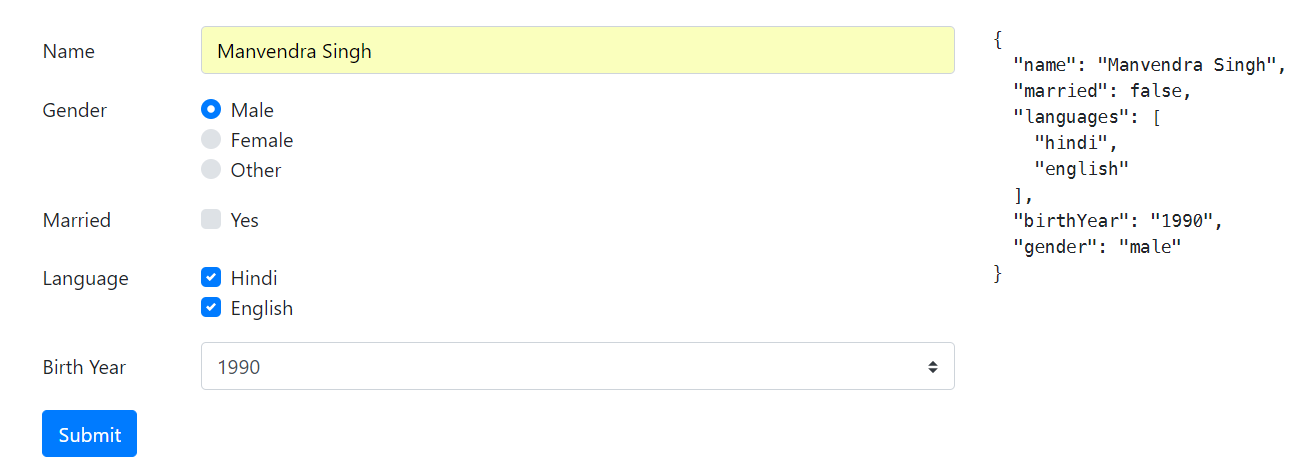
You can find the sample application on the Github2. Here is the screenshot of running application.

I thought of showing a custom Select Box, but I guess, that’s for later. Stay tuned!
Thanks for stopping by. See you next time.